protest tees (CLIENT: tee-rex)
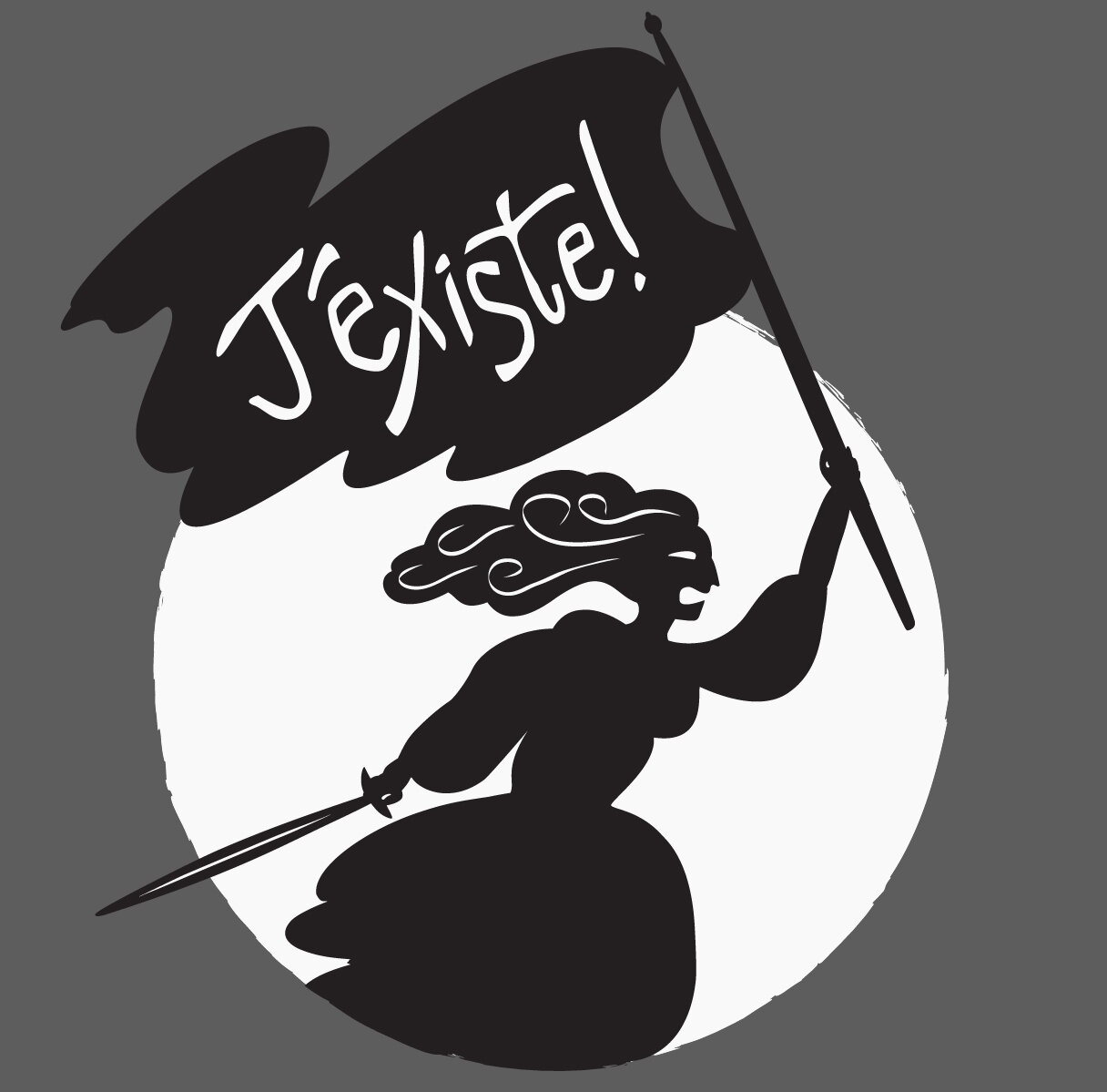
“J’Existe” (I exist!) Attention feminists, LGBTQ folks and their allies — Blood, sweat, bricks, and tears: You exist! Here's a sartorial subversive punch in the face to the patriarchy everywhere. Want one? Just ask and I’ll send you the file!
“Je Resiste!” (I Resist!) Here's a furiously elegant tee that will take you from screaming melees to smoked salmon and Bloody Marys. Hey, you can protest and still look cute. This “allegory of resistance” holds a torch symbolizing liberty and a downcast (unshod) sword representing victory. Why is she winged? She’s an allegory for crying out loud. On the globe is the Latin “Per Aspera Ad Astra” — “through hardships to the stars.”


“look magazine” wedding favor (CLIENT: Mr. & Mr. jones-ochoa)
What is this project about? The grooms are friends of ours who live in Paris (I went to high school with one of them) and they asked us (my husband and I shown together with the LOOK magazine) to make a giveaway for their wedding.
What did the client specifically ask you for? Buck, the groom on the left (who also looks a bit like my husband but they’re not related), was equal parts vague and specific. 1. It had to be a vintage-inspired “magazine” for guests as a memento. 2. He wanted it set in 1964. 3. The grooms wanted to be interviewed separately for it and maybe “some articles or something and fake ads or something.” 4. “Feel free to make it ‘somewhat inappropriate’ in the way the ‘60s actually were.”
Did you use any old original ads? No, I made them all and that was a blast. Even the one ad I thought we’d just be able to find (a Pepsi ad with Joan Crawford) didn’t exist (but she did a couple for Crown Cola but they were from the ‘50s) so I created one and used the boardroom scene from Mommie Dearest for copy as though she was interviewed. The grooms really loved that Pepsi one but the ad (not shown) of one of the grooms as a toddler eating paint chips — “a nutritious snack!” — was the real crowd pleaser.
What about the map? The wedding took place on a yacht and we wanted the guests to know what they’d/we’d be seeing as we cruised and dinned so I whipped up the map and my husband came up with the factual inserts.
And the mailing label? That’s my favorite part. The grooms hadn’t requested it but they did need place cards for each guest. We told them to come up a list of where they wanted people to sit and which table, and to leave the rest to us. After printing them out I washed tea bags over them to age them but they didn’t look right so I bought a hole puncher — et voila! Every guest’s name (all 70) is on a label and the LOOK magazine doubled as a place card.
How was LOOK’s reception? We brought the booklets over ourselves and the day before the wedding the grooms saw them for the first time. We hadn’t shown them anything at all prior — no sketches, no comps, no nothing — and they were literally shaking as we handed one to them to look at together. We held our breaths. Their shaking dissolved into tears and then to boisterous laughter. It was a true labor of love and nothing was more rewarding than their reactions.


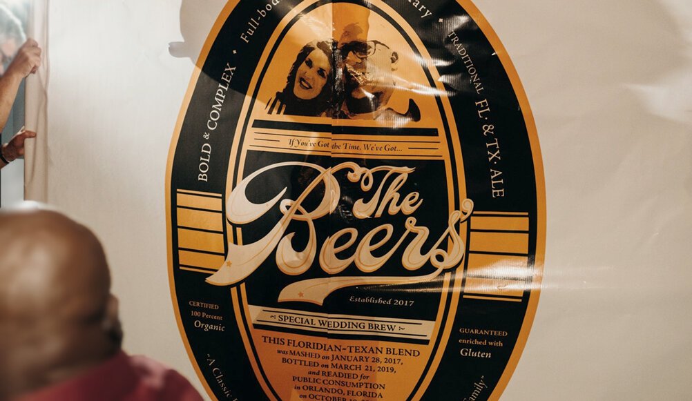
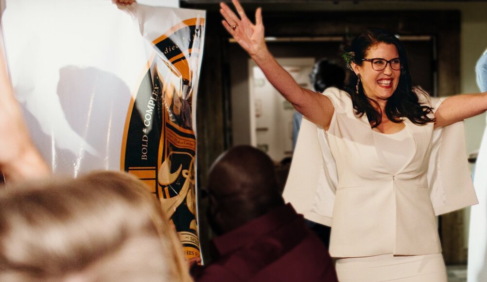
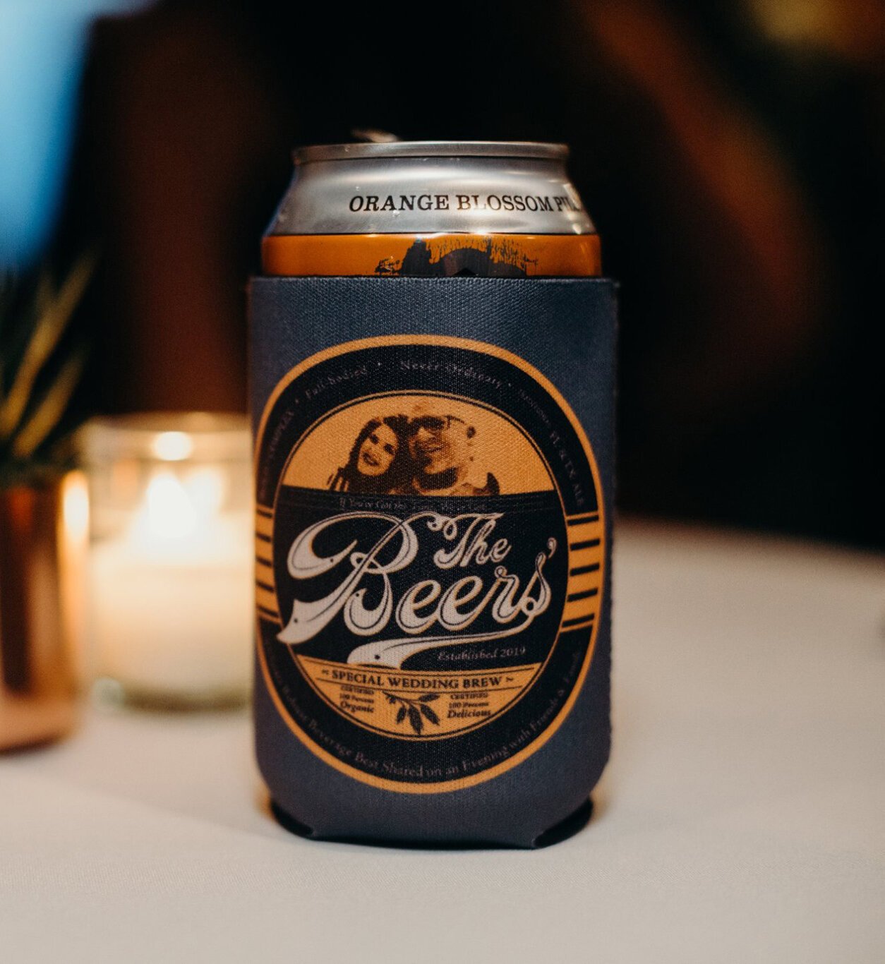
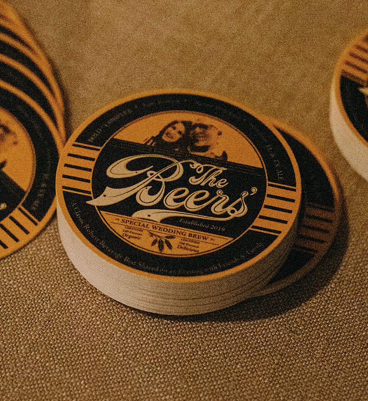
Beers’ wedding coasters, koozies and breakaway (CLIENT: Mr. & Mrs. Beers)
One of my best friends wanted a breakaway banner for her wedding and beer-related collateral (because that’s their last name) with a vintage feel. And we did it!
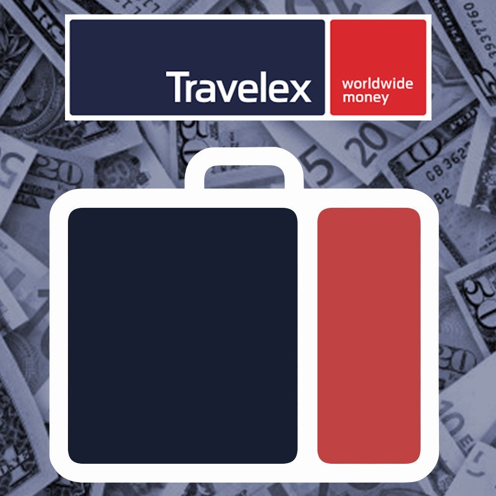
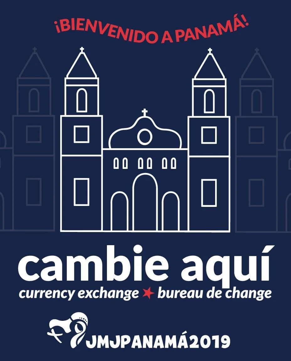
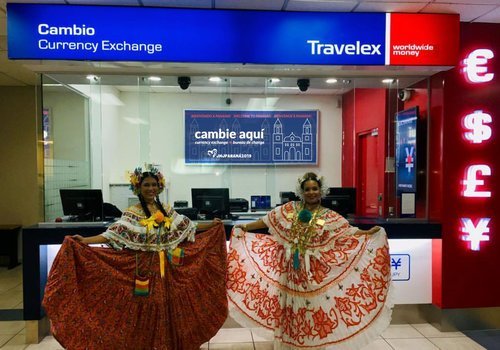
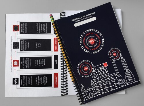
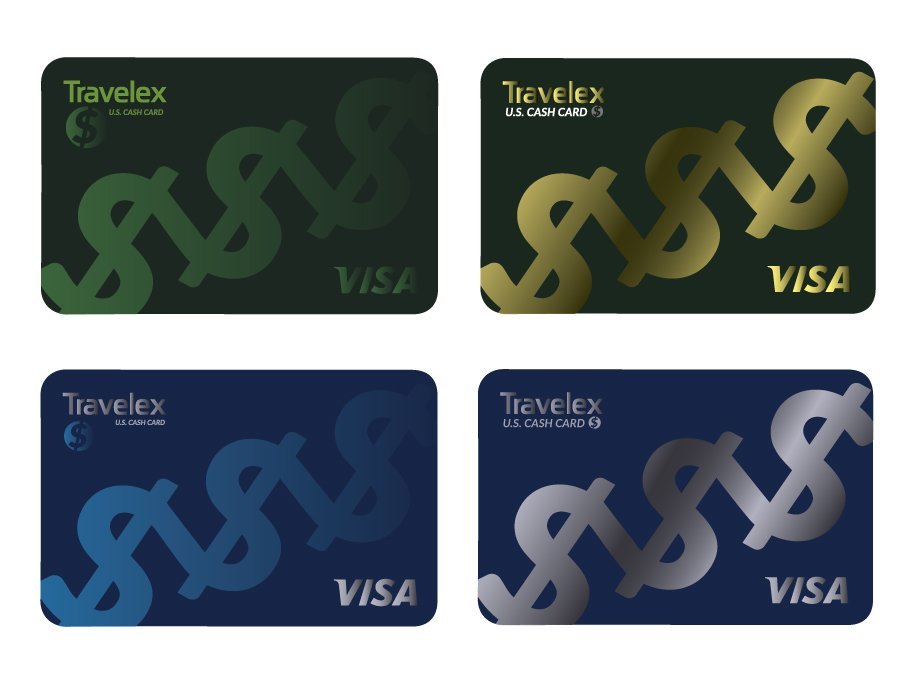
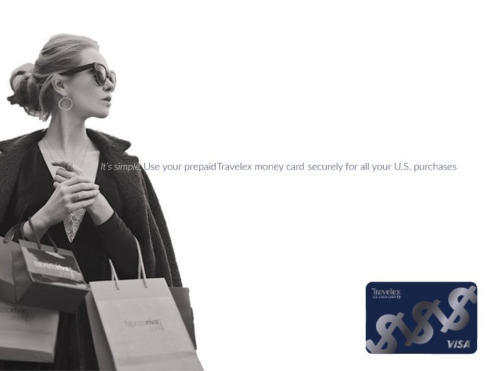
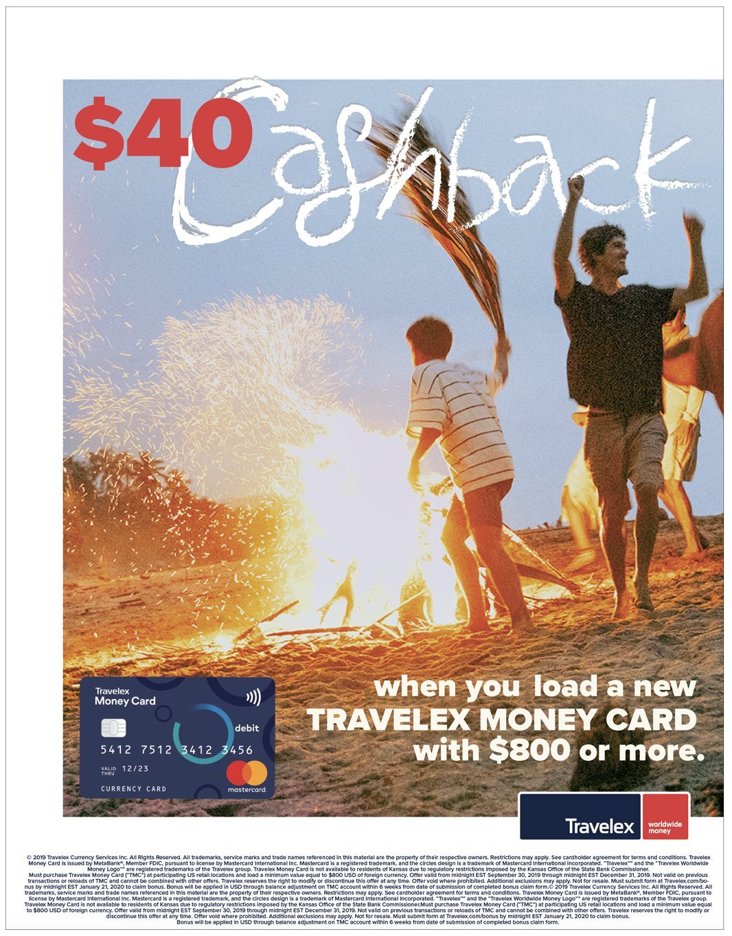
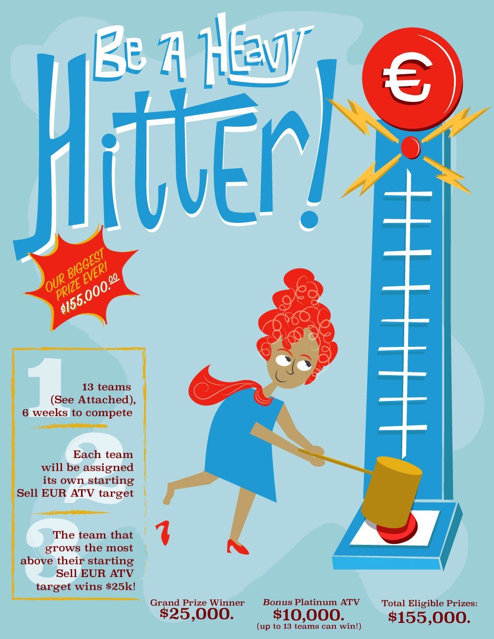
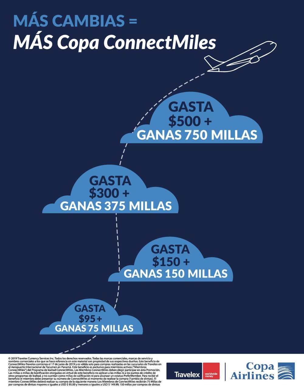
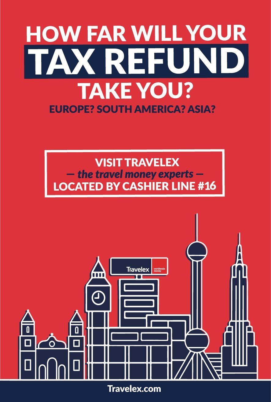
travelex, New York, panama, canada (Client: travelex north america)
Every TravelEx store in North America kept me super busy from posters to performance review booklets, etc., and the best part? I designed the “luggage logo” on my lunch break on my first day and the CEO loved it and we used it for social media icons and giveaway luggage tags.