Kindly hover over images for additional thoughts and important acknowledgments in the creative process. Or hover hatefully; it’s your journey.
(Unless otherwise noted, I designed the key art, title treatments, and art directed these featured campaigns. Also, all the these campaigns were chosen and actually used except for those images in the “creative development” category at the bottom of the page. )
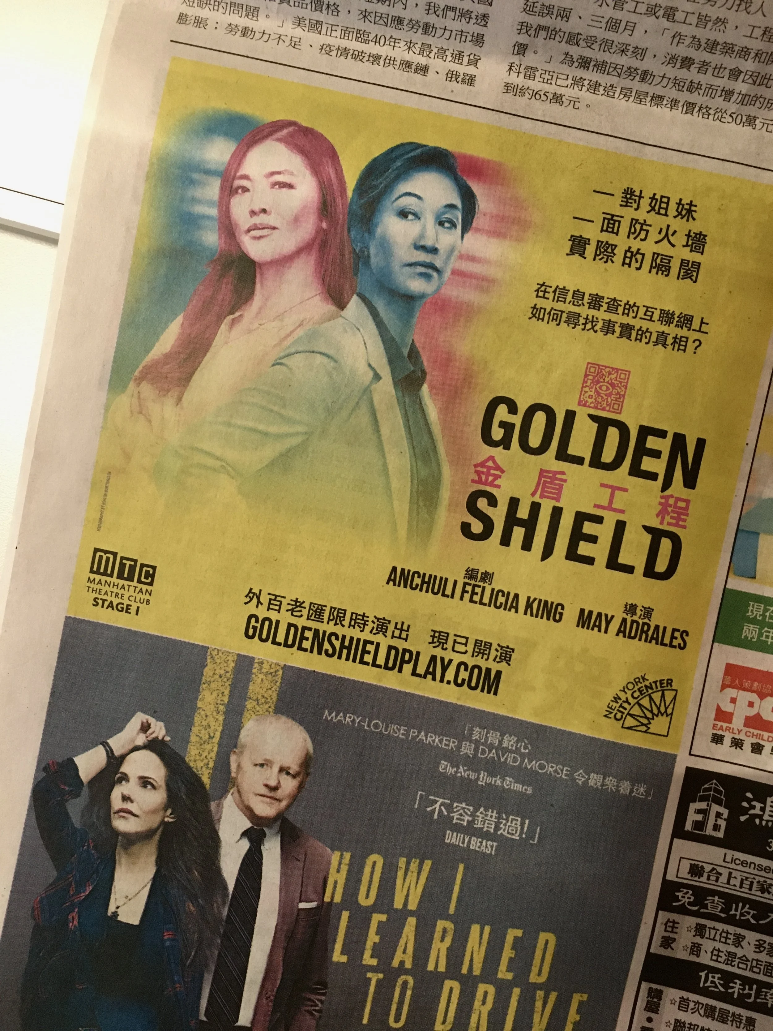
Golden Shield (MTC/ AGENCY: SERINO COYNE)
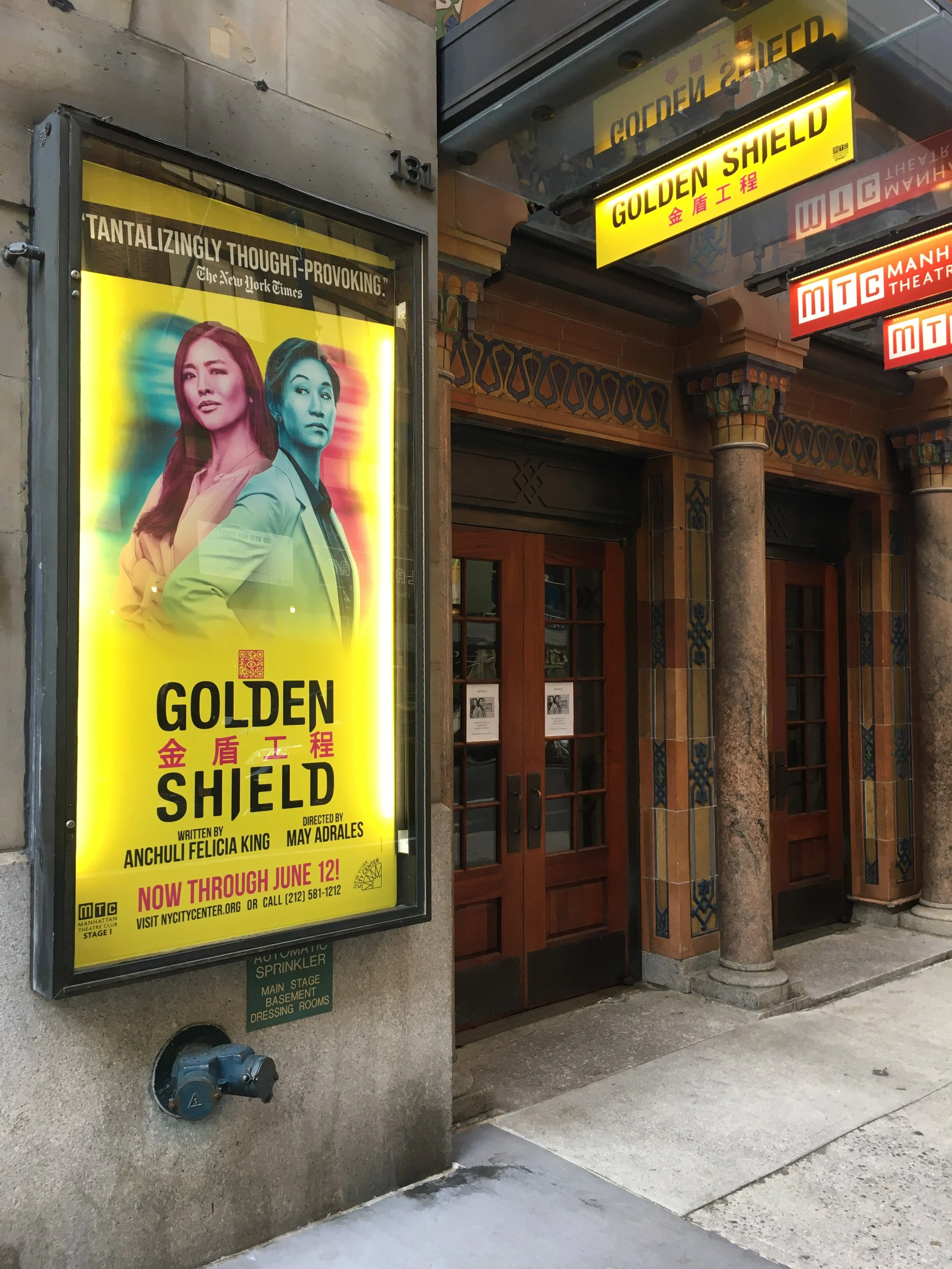
ECD: Jay Cooper — Photography: Ashton Worthington — Art Direction: Christina D’Angelo
The brief: It’s about two sisters (one is a lawyer and the other a translator) and it’s based on a real court case that travels from Texas to China. It’s about censorship and what gets lost in translation (on multiple levels).
Favorite part? The QR code I made (which felt like a Chinese chop with an all-knowing eye in the center: a reference to Chinese surveillance mentioned in the play) that was used throughout the campaign. I also loved tweaking that Helvetica-based title treatment so it had just a wee calligraphic feel to it.
ECD: Jay Cooper — ART DIRECTOR: Christina D’Angelo
THE FOLLOWING TWO SHOWS ARE COMING SOON! (AGENCY: THE PEKOE GROUP)
A WONDERFUL WORLD, THE LOUIS ARMSTRONG MUSICAL (Broadway’s studo 54)
MIDNIGHT IN THE GARDEN OF GOOD AND EVIL (Chicago’s Goodman Theatre)


The Al-Hamlet Summit — The New Electric Ballroom (both: Danú THEATRE Dubai)

I was lucky the client wanted it to be “brazen” and “as provocative as Sulayman Al Bassam’s brilliant re-imagining of Shakespeare’s Hamlet; and unlucky when the theater said they couldn’t show a gun. But several more comps later (SEE CREATIVE DEVELOPMENT BELOW) they finally agreed to the first comp.
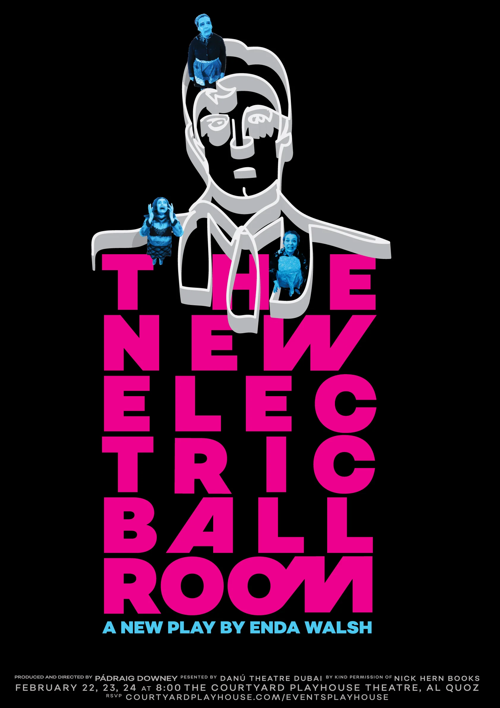
This is a terrifically odd and disturbing play by Irish playwright Enda Walsh and it was a challenge. It’s also one of the few plays I read that still left me confused about the tone. Thank God there were filmed performances I found online and then it made sense. Here’s when it clicked: the three women are essentially trapped by their obsession with this singing Lothairo who comes to their small town and spends a night with them each. They can’t stop reliving the night. I called a friend for help. I described each character and asked her to smear lipstick on her face and dress up as each of the women. I asked her husband to stand on a chair and email me lots of pictures. I turned the women’s dreamboat obsession into an actual maze and stuck the women inside — they’re trapped. Favorite part? Making that “o” to “m” ligature
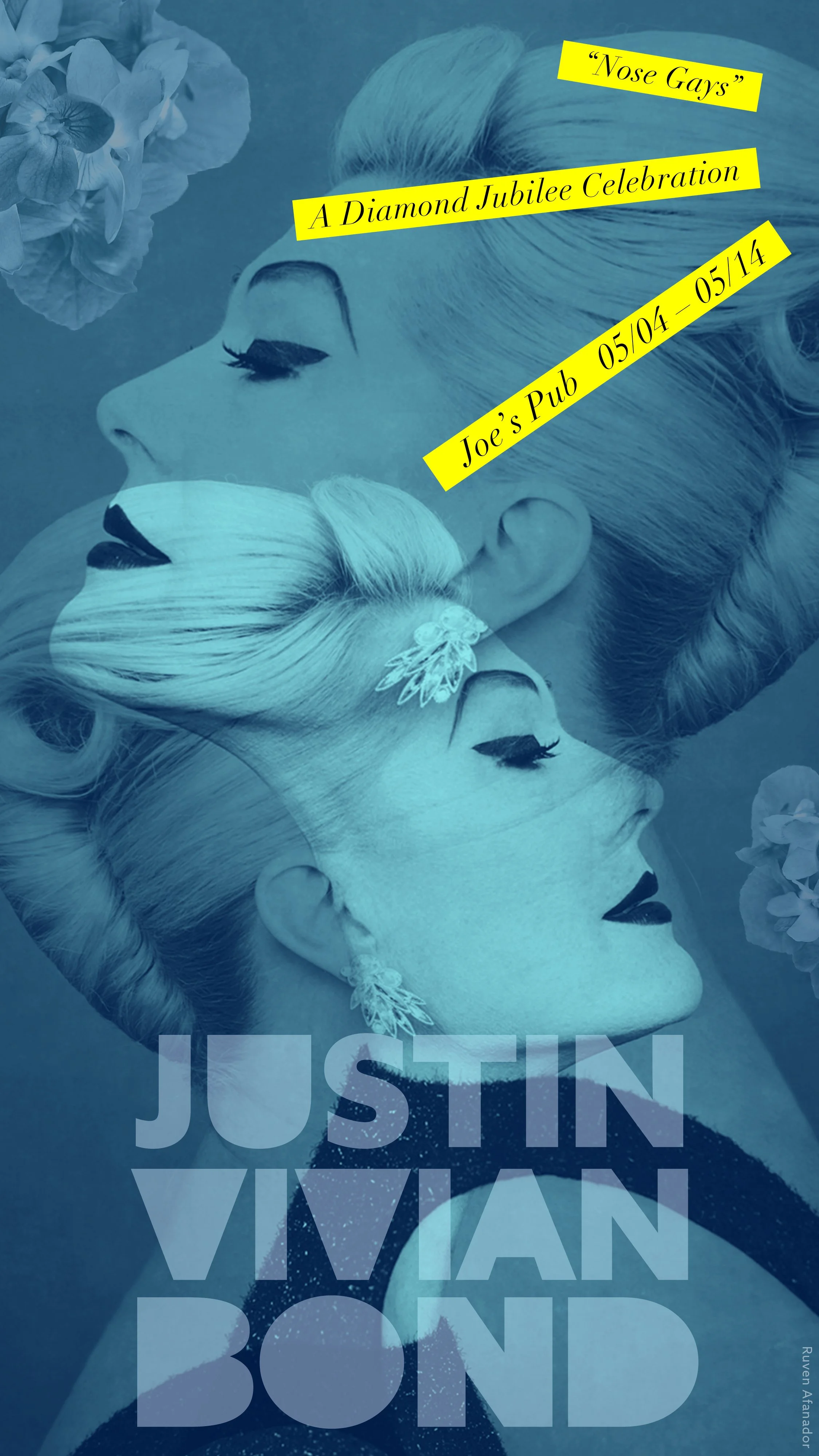
client: mx justin vivian bond at Joe’s Pub


endgame (Danú THEATRE Dubai)


Let’s be real here: Beckett’s all about a profusion of monosyllabic absurdisms and chewy thought-provoking lines; not plot lines. We felt we owed it to Dubai theatergoers to let them know this was heady and odd fare. Essentially we wanted the text to do the talking here and there was so much to choose from. These two lines really struck me so we went with them. At the time I was designing for Travelex and only had about a day and half build this entire campaign (mercifully it was only digital except for the printed show bills, and poster at the theater). Favorite part? I loved the simplicity of — and speed of designing — this campaign. I was grateful the client agreed to the circular “…the end is the beginning…” (my favorite of Beckett’s) because the theater was second guessing it at first. This should be a magnet now that I think about it.
Rock & Roll Man the musical (agency: SERINO COYNE)

ECD: Jay Cooper — ART DIRECTOR: Christina D’Angelo — PRODUCTION DESIGNER: Taylor Crews

ECD: Jay Cooper — ART DIRECTOR: Christina D’Angelo — PRODUCTION DESIGNER: Taylor Crews
The glass menagerie (Danú THEATRE Dubai) — A doll’s house (Danú THEATRE Dubai)

What was the first thing that came to mind when Danu Dubai asked you to design this campaign for Glass? After the elation wore off — because I love this play — I wrote what I didn’t want to do (feature a glass menagerie) then wrote down what I felt the play was really about: memory, emptiness, a yearning for what can never be and that felt like an empty embrace — et voila! Favorite part? Because of this poster, I was asked by another client (in New York) to do the campaign for a totally different version of The Glass Menagerie with a completely different angle and feel — it’s a great challenge and I’m so excited to delve back into this show creatively twice.

Where the mountain meets the sea (MTC/agency: SERINO COYNE)
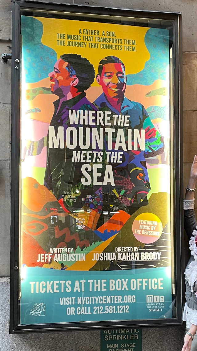
ECD: Jay Cooper ILLUSTRATOR : Zharia Shinn ART DIRECTOR: Christina D’Angelo
This is a vibrant play with original music about a father and son and their separate/overlapping journeys. The best part? Hands down, art directing the terrific collage artist, Zharia Shinn, was the best part — easy and fun to work with and the results exceeded our expectations! To see a quick video of Zharia’s process click this link.

ECD: Jay Cooper ILLUSTRATOR : Zharia Shinn ART DIRECTOR: Christina D’Angelo
THE JO-LYNN BUTTERFLY COUNTRY HOUR OF SUNSHINE (Angela Di Carlo)—SONG & SASS (Jack Bartholet, Angela Di Carlo) — FOUR OLD BRoaDS ON THE HIGH SEAS (Leslie Kimbell)


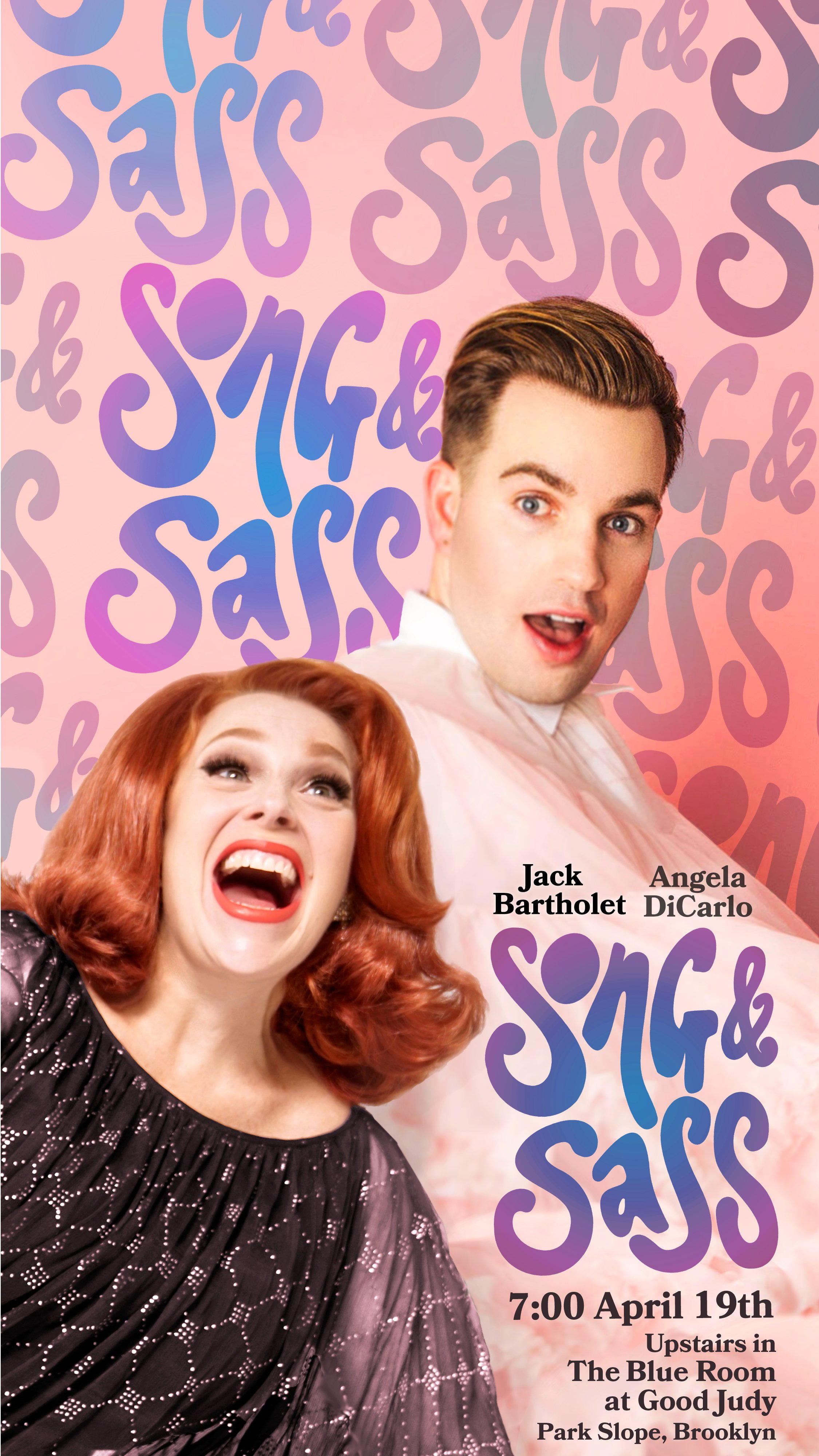
Hand-drawn fun little tittle treatment because if you make something pretty on Procreate while watching Real Housewives you won't feel like a total looser.
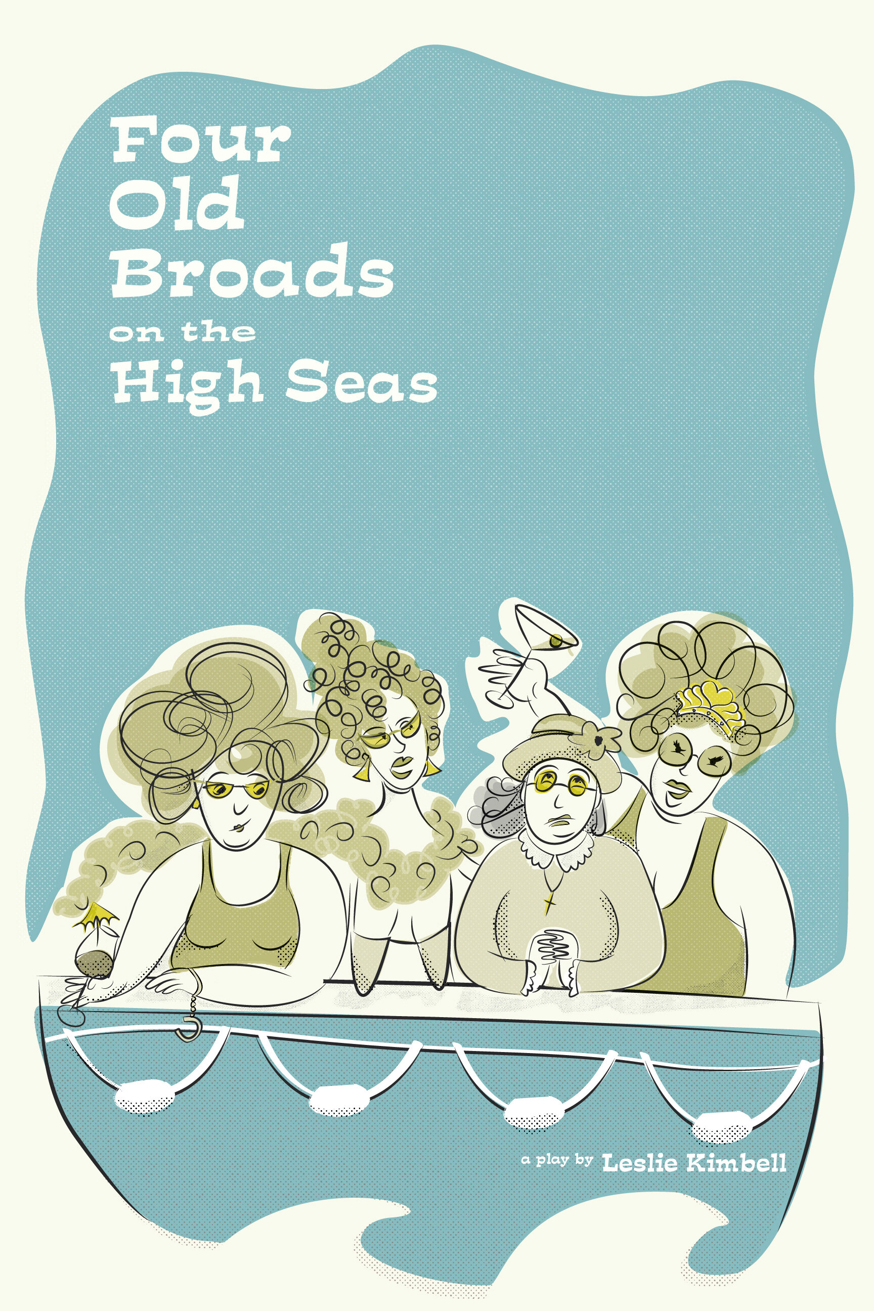
What was the creative brief for this one? First of all to watch the video, which was hilarious, and secondly to illustrate “all the characters in a boat and make it ridiculous.” I drew several versions (including an unfinished colorful version under “CREATIVE DEVELOPMENT” at the bottom of this page) but we ended up going with this vintagey feel. I hope this makes it to a longer Off-Broadway run because I’d love to really glitz this up a little and make it roar with color.
short + sweet festival
curtain call (Seán Ó Súilleabháin)

Creative brief: It’s about an actor’s metaphorical curtain call on his deathbed. What was the biggest challenge? I was hired by two different clients in this short play competition (The other was The Landlady) and needed them to look nothing alike whatsoever.
the landlady (padraig downey)

Creative brief: It’s about a land lady who kills folks. This was pretty much the fastest thing I've ever done. Favorite part? I was surprised to learn there was a category in this short play competition for best poster and this won out of 70-something posters.
burke & hare (Seán Ó Súilleabháin) — the walworth farce (Danú THEATRE Dubai)

Creative brief: “make it scary and bold” and people should know “it’s based on a true story.” I felt the fastest way to achieve both directives was to tell people the facts (so I wrote the copy) and to show a dead body and/or the creepy apartment building where the murderers lived. The client agreed to both versions. Favorite part? The ampersand strangling the title.

Everything is intentionally and obviously handmade in the play (including the coffin) so I wanted to create a title treatment that actually IS the play itself and make the “O” into the coffin and make the wig wiggy. The Walworth Farce is RIVETING and challenging and this was a breeze to design — this is the only comp I presented and that’s the only time that’s happened.

King James (MTC/agency: serino coyne)
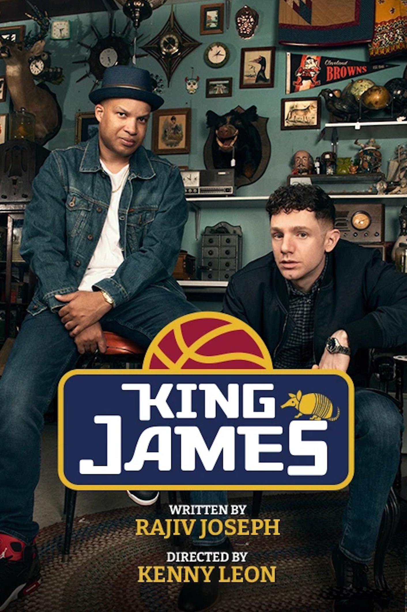
ECD: Jay Cooper — Art Director: Christina D’Angelo
Who says you have to know basketball to design a “logo” for a basketball play? Armand the taxidermied armadillo is an important reference in the play and the client used it in the beginning (he lived briefly!) and later we went with my second design to lock in all the billing.

ECD: Jay Cooper — Art Director: Christina D’Angelo
The Phillie Trilogy (doug devita) — WOMAN AND SCARECROW (Danú THEATRE Dubai)


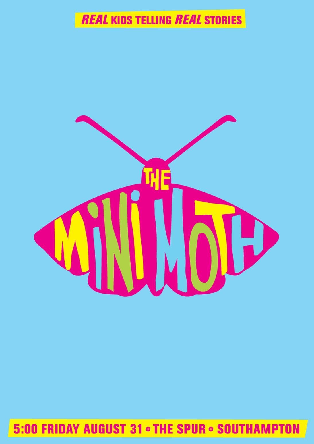
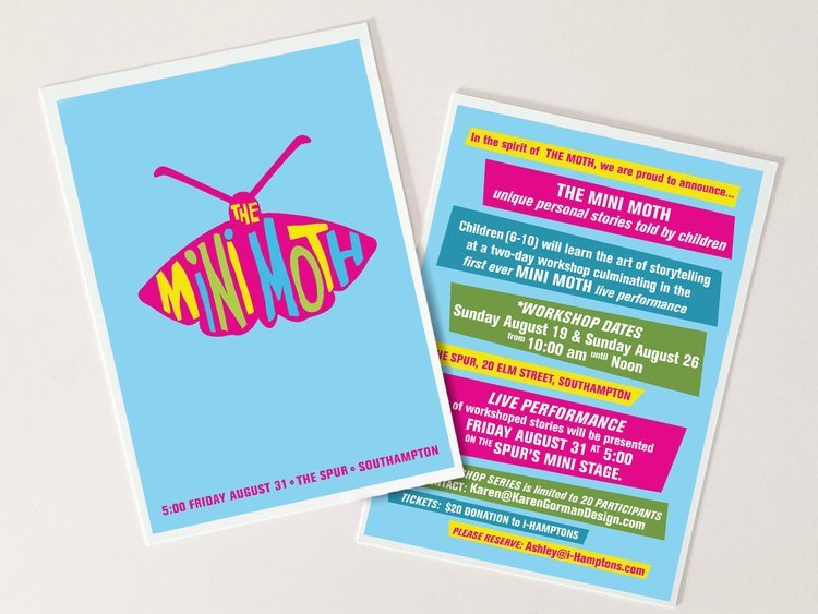
the mini moth ( KAREN GORMAN FOR MINI MOTH)
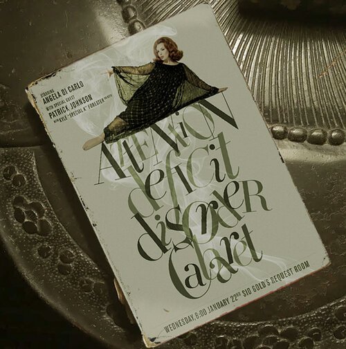
ATTENTION DEFICIT DISORDER CABARET (ANGELA DI CARLO)


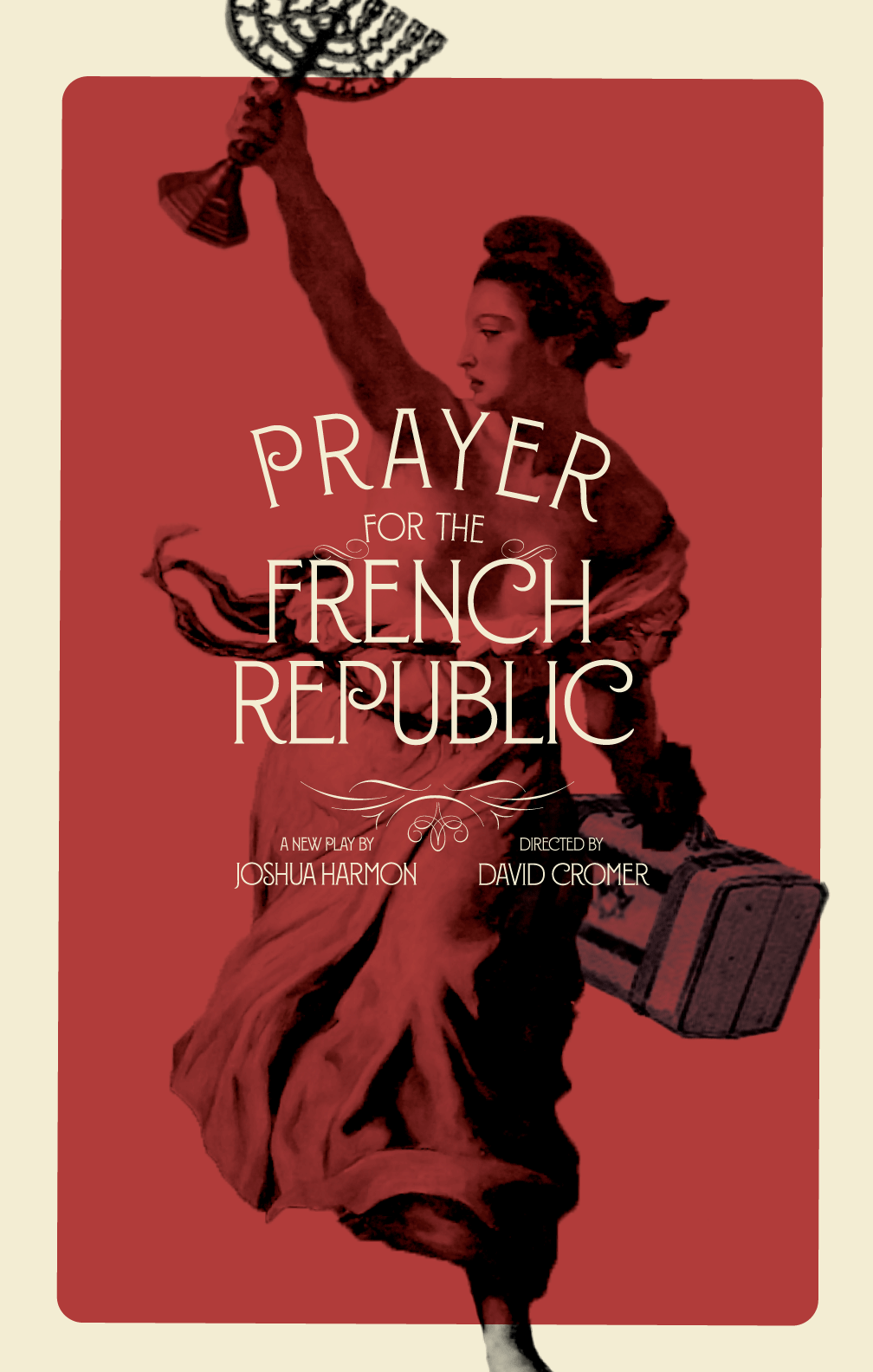
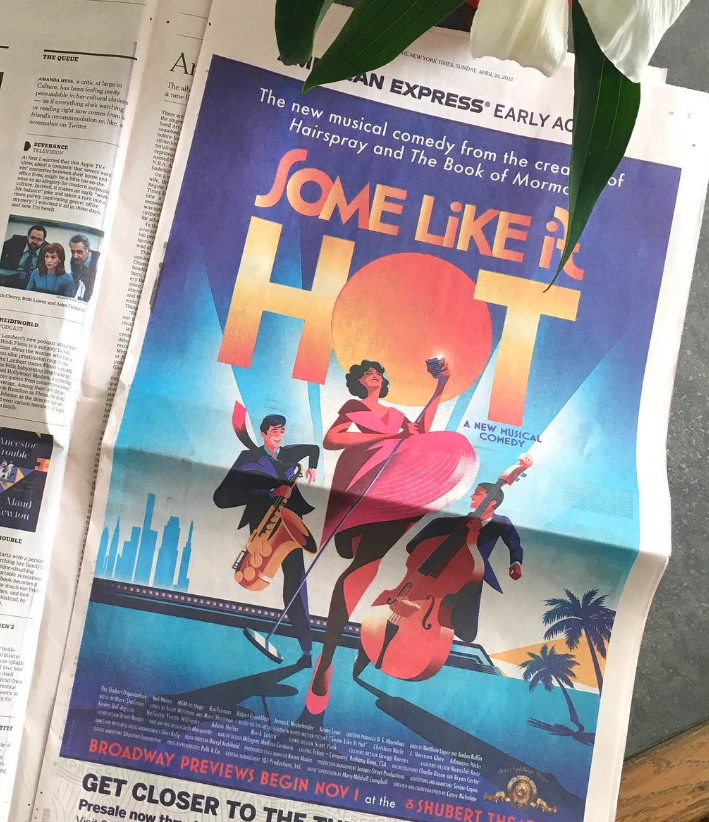
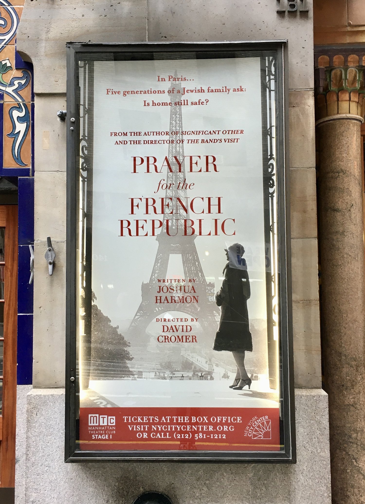
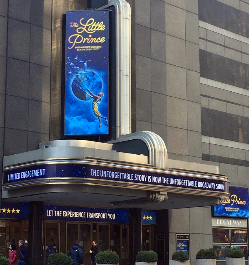
ART DIRECTION AND/OR TITLE TREATMENTS ( agency: SERINO COYNE)
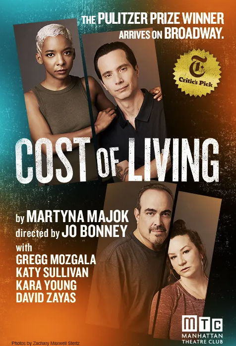
The below images are from campaigns I either designed the initial title treatments for (Some Like It Hot, Prayer for the French Republic, etc.) or art directed through to production with pre-existing artwork (The Little Prince, Cost of Living, etc.) that I may (in some cases) have zhuzhed up a wee bit. (Also, if you haven’t seen Some Like It Hot, check out this link)
creative developement
What in God’s name does that mean? Relax, I’ll tell you. These are all either unused concepts (or comps as we call ‘em), or in some cases, comps that lead us further down a path to more refined key art. Note: to see the images in full, please click. And another note: these are all rough works-in-progress comps. One more note and I swear I’m done: I inserted a photo of me and President Jacques Chirac in a comp here, and so help me God, don’t think I won’t do it again because I will.